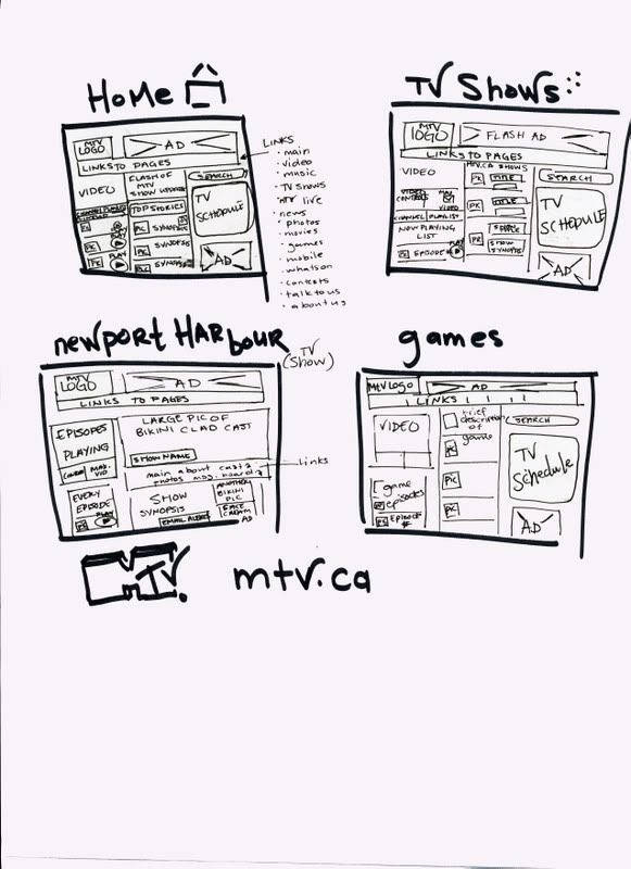
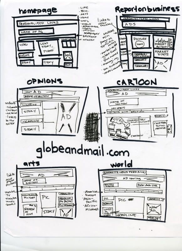
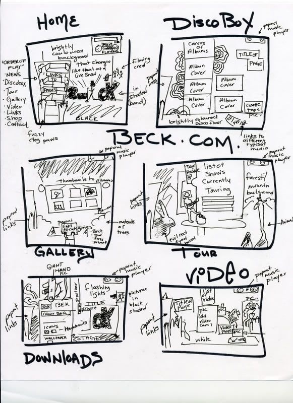
So, i tried to find a few different pages, with different layouts. it seemed that a lot of pages were filled with basically the same layouts and many many ad's the only page that didnt have ad's were band webpages (i.e. beck.com). i guess the reasons for this would be funding. the globe webpage was strucured very simply, much like a regular newspaper and each section corresponded to how it would look in a paper and who the audience is. the mtv.ca page was very busy and flashy... which i suppose reacts to the audience to which is appeals to. the pages were all set up the same, so i didnt continue drawing more.
so here are my storyboards. --if the image is too big then you can just drag it into to address bar for a full size look;)--
MTV.ca website layout
 globeandmail.com
 website layout
 Beck.com
 website layout


No comments:
Post a Comment